How to Choose Ribbon Colors When You Don’t Know Their Favorite Color
The Gift-Giver’s Dilemma
You’ve decided to give a ribbon bouquet gift. You know it’ll be beautiful, lasting, and meaningful. But then comes the moment that stops almost every gift-giver cold: which colors do you choose when you have no idea what they like?
This fear is real and incredibly common. Nobody wants to hand over something that misses the mark. But here’s the truth: when you don’t know someone’s favorite color, you actually have more freedom than you think. You can choose based on emotion, read the occasion, and use design strategies that work beautifully for almost anyone.
This guide removes the guesswork. Use these four strategies to choose ribbon bouquet colors with confidence every single time.
Strategy 1: Choose Based on Emotion, Not Preference
Forget trying to guess their favorite color. Instead, ask yourself one question: What do I want them to feel when they receive this? That answer points you directly to the right palette!
Color communicates emotional meaning before a person even processes what they’re looking at. Warm colors like red, coral, and orange energize and excite. Cool colors like blue, lavender, and sage calm and comfort. Soft neutrals like cream, blush, and dusty rose feel universally warm and graceful.
Map your intention to a color family:
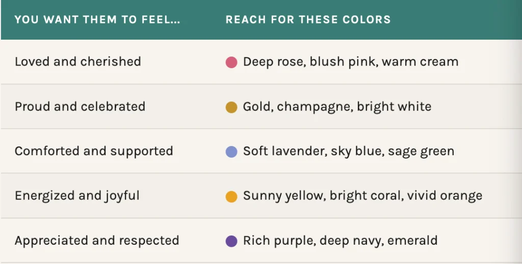
This approach works because ribbon bouquet gifts communicate emotion visually, long before they’re unwrapped or explained. Lead with feeling and the colors will follow naturally.
Strategy 2: Let the Occasion Guide You
When personal preference is a mystery, the occasion itself becomes your clearest signal. Every major gift giving occasion carries its own color language one that most people instinctively recognize and appreciate.
Celebrations (Birthdays, Promotions, Graduations)
Reach for warm, energetic palettes. Bright pinks, golds, champagne, coral, and vivid yellow all communicate joy and achievement. Add metallic ribbon accents to elevate the celebratory feeling. These colors cross personal taste easily and almost everyone responds positively to vibrant, warm celebration palettes.
Gratitude and Appreciation
Soft, warm tones do the heavy lifting here. Blush pink, dusty peach, and creamy ivory express appreciation without overwhelming. For professional appreciation thanking a mentor, honoring a colleague cool, elegant tones like muted blue or deep plum feel polished and appropriate across almost any personality.
Sympathy and Support
Soft, muted palettes communicate care without adding noise. Lavender, pale sage, soft blue, and white all provide gentle comfort. These shades work universally in sympathy contexts because they feel calming rather than stimulating, exactly what someone navigating grief needs.
Romance and Milestones
Romantic occasions almost always welcome classic palettes. Deep reds and roses for passion. Blush and ivory for elegance and tenderness. You rarely go wrong in romantic contexts with these timeless combinations they carry universal associations most people connect with immediately.
Learn why ribbon bouquets make lasting emotional gifts →
Strategy 3: Use Neutral + Accent Color Pairings
One of the smartest moves in bouquet color design is building around a neutral base with a single pop of accent color. This technique works beautifully when you’re unsure of preferences because neutrals are universally appealing and the accent color carries the emotional message without risking a full palette miss.
Reliable Neutral + Accent Pairings
- Ivory + soft blush: Romantic, elegant, and feminine without being overwhelming. Works for nearly any woman-identifying recipient regardless of personal taste.
- Cream + sage green: Natural, serene, and grounded. Crosses gender and age beautifully. Perfect for plant-lovers, nature enthusiasts, or anyone with a calm, earthy personality.
- White + gold: Celebratory and sophisticated. This pairing communicates special occasion across nearly every cultural context. Safe for professional gifts, milestone celebrations, and formal appreciation.
- Soft grey + lavender: Cool, contemporary, and calming. Ideal for someone whose space tends toward modern, minimal aesthetics or when you genuinely have no read on personal taste at all.
These combinations give the bouquet a strong visual identity and clear emotional intention without relying on personal color knowledge. They’re sophisticated, not generic and they photograph beautifully for the recipient to share.
Strategy 4: Know When to Play It Safe vs. Be Bold
The relationship you share with someone tells you a lot about how much color risk to take. Use this as your guide:
Play It Safe When…
You don’t know the person well, the occasion is formal or professional, you’re giving a sympathy or memorial tribute, or the gift will be displayed in a shared or public space. In these cases, classic palettes like whites, creams, soft blushes, muted blues communicate taste and thoughtfulness without risk of a color clash.
Go Bold When…
You know the person has a vibrant, expressive personality. The occasion is celebratory and personal a best friend’s birthday, a sister’s promotion, a partner’s anniversary. Bold, unexpected color combinations communicate that you truly see them. A hot pink and tangerine bouquet for someone who always walks into a room and owns it? That’s a ribbon bouquet that tells a story.
When you understand ribbon bouquet gift giving as emotional communication rather than a test of personal preference knowledge, the pressure disappears. You’re not guessing their taste, you’re expressing your intention. That shift makes every color choice feel purposeful.
Explore ways to personalize your ribbon bouquet →
Color Confidence Starts with Intention
You don’t need to know someone’s favorite color to give them a bouquet that feels perfectly, unmistakably them. You need to know what you want them to feel, read the occasion clearly, and choose colors that carry that message beautifully.
Ribbon flowers make this easier than any fresh arrangement because the palette is unlimited and the colors last. Whatever you choose communicates your intention indefinitely which means every decision you make matters, and every decision you make with care lands exactly the way you hope.
Want to go deeper? Read our full guide on ribbon color meaning and how design communicates emotion to understand the full language of color in bouquet design.
Ready to build a bouquet that says exactly what you mean even without a color shortlist? Explore our full custom range or talk to us about the perfect palette.